
Featured Image From Mapping Inequality
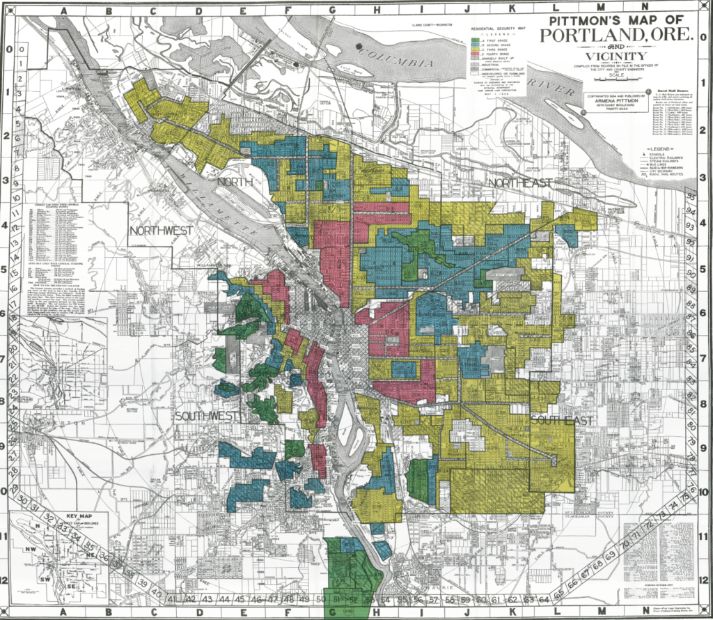
A look at a Redlining map of Portland, Oregon can offer immense insight into the city’s past, but it also provokes many questions. My first thought when looking at the above map was “how can two neighboring areas be classified into two opposing groups?”. I was especially interested by the zones within Southwest Portland. In this area, there are many green “best” zones but also red “hazardous” zones.
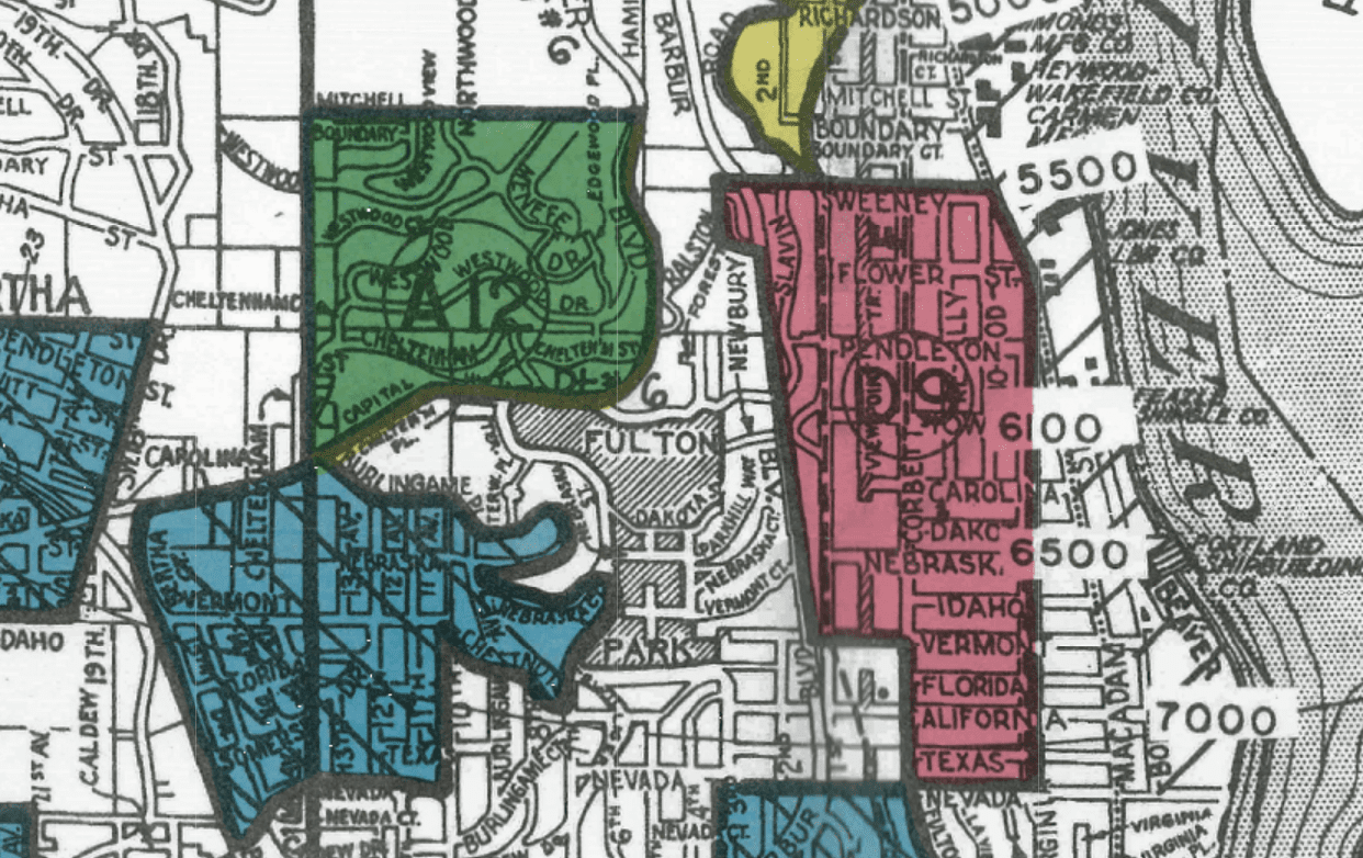
I decided to focus my investigation on one smaller area of Southwest Portland (pictured above). How can two zones, separated by what looks to be a few blocks, be classified so differently?
The first step I took in answering this question was to orient myself to this area. The following map shows an updated aerial view of the northern areas of the above zones. The “best” zone, Terwilliger Heights, is on the left-hand side. This neighborhood is set apart from highways and industry, separated by nature parks. The houses are set upon winding and looping roads, each with substantial greenery.
The neighboring area to the east, however, is composed primarily of industry. The gridlock pattern of streets and houses make up South Portland. This area, according to the redlining map, was once a “hazardous” zone.

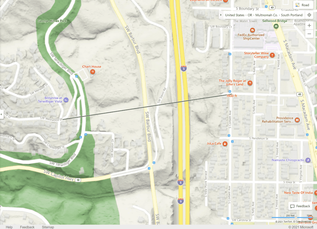
As seen in the map below, these two neighborhoods were separated by a distance of only 1900 feet. As of the 1960s, these areas were divided too by Interstate 5. Why were they so different before this physical divider?
The 1940s Census tells us unique stories about the people who lived two neighborhoods. Terwilliger heights was composed of single-family, mansion style homes. Families in this neighborhood were almost entirely white and wealthy. The Census for the neighborhood around SW Westwood Dr. and SW Menefee Dr. show that family incomes ranged between 2000 and 5000+. Most people in this area were born in Oregon or a neighboring state. Very few were immigrants from other countries.
The South Portland “hazardous” zone, however, was made up of many different groups of people. While both neighborhoods boasted single-family homes, South Portland’s houses were much smaller and closer together. Families here, while still predominantly white, come from all different areas. The Census for this area showed that many people here were immigrants from European countries such as Italy and Sweden. Family incomes were between 500 and 1500.
The main difference I saw between these neighborhoods were between the backgrounds and occupations of the residents. The people of South Portland, living in an industrialized area, mostly worked in industrial positions, such as laborers and machinists. Residents of the Terwilliger area, on the other hand, had positions such as lawyers and business men.
The divide between these neighboring areas, now solidified by I5, looks to have been created because of the residents in these places. This, in turn, was caused by the proximity of these neighborhoods to industry.
Madi, I really like your essential question here. These zones felt so arbitrary. For my own post I was surprised by how the proximity of “undesirable peoples” brought down a nearby neighborhood. Its seems like an impossible system! It seems especially frustrating for the area that you were looking at in SW and S Portland, where neighborhoods were so much denser.
First off kudos for designing such an interesting investigation around a thoughtful question – how could 1900 feet make such a difference in home value and family economics?
I’m guessing most people today simply assume that people with money live in the West Hill because it offers such great wooded privacy and grand views of the mountains. But that that backward thinking ignores the challenges of building on such terrain. In contrast. – Rocinha, the largest favela (shanty town) in Brazil, is built on a steep hillside overlooking Rio de Janeiro, and is located about one kilometre from a nearby beach.
Your research digs into the connection of income levels and redline HOLC policy to develop a thoughtful answer to your question. And you demonstrate insight when you note that I5 expressway has “solidified” those social and economic barriers between different neighborhoods. That practice is well documented across the country. There are countless examples of expressways and other public projects located by both the need to “more permanently divide” rich and poor as well as to use expressways to “clear out” poor neighborhoods. Case in point: Moda Center / Memorial Aud and I5 decimated what was a thriving Portland African American community.
You should take pride in this first-rate post that combines research and intuition to force us to question our assumptions about how our built environment is a product of the intersection of class-based economics and public policy.
Madi, this was awesome. I think it’s especially cool since you’re a Portland native. I’m sure getting to look at these redlining maps leaves an even great effect on you since you probably know the city so well. Even as someone who’s relatively new to Portland, it is really perplexing how these nearby neighborhoods could be divided in such a way. It seems incredibly arbitrary, which I think you made good light of in your post. Well done!