Teaching with Data

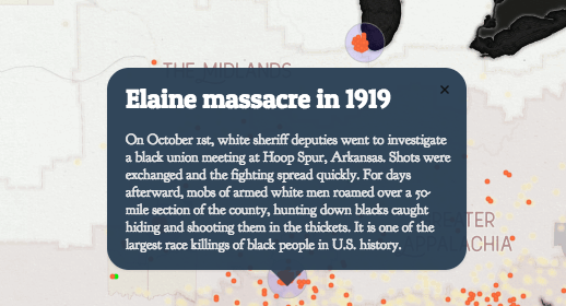
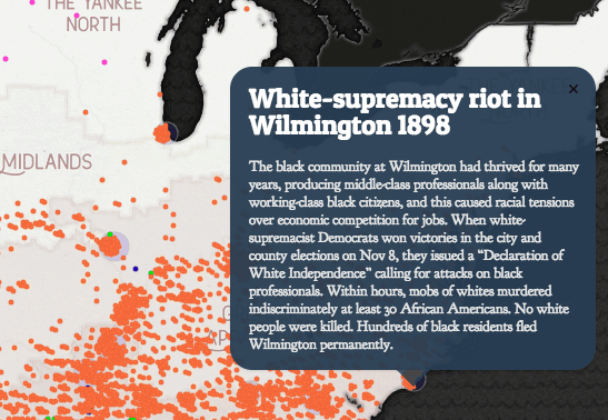
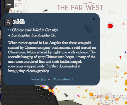
For my lesson, I would use the map of mob violence. Students would be instructed to go to the site and use it as a jumping point to research different acts of violence. Students would be separated into small groups, and they would work together to research the violence that occurred in different regions of America. Regions would be separated into the regions this map creates: “Left Coast”, “Far West”, “Yankee North”, “Spanish Heritage El Norte”, “The Midlands”, “Greater Appalachia” and “The Deep South”. Students would use this map as a jumping point to research the mob violence that has occurred in this region over the years, and how it changed over time. For example, the west coast had quite a few Native American victims of mob violence during the early years of this map and eventually has more Chinese victims. Each plot point can be clicked on and the story behind the violence can be expanded (see screenshots below). Many of the plot points link to sources, which would allow students to find more details on the killing, and be able to present a fuller story about why these incidents of mob violence occurred.

Students would research a few of the incidents to find greater detail, and present their findings to the class. We would use their findings to discuss the history of mob violence in our country, as well as draw parallels to issues we see today. This could be used in conjunction with a unit about progressive reforms, civil rights, or something along those lines.

Metrocosm & Immigration

Here’s Everyone Who’s Immigrated to the U.S. Since 1820

This interactive map shows immigration movement into the US from the rest of the world between the years 1820-2013. It also shows the amount of people entering the US, along with the top 3 countries immigrating at that time. The map runs automatically on a loop, as it goes through the timeline.

I can imagine using this in a history class when discussing the wave of European immigration towards America during the early 1900’s. It provides a great visual for students to be able to see moving parts from other countries to America overtime, and when in history immigration was high and low. This map, particularly, demonstrates nicely the influx of immigrants during the early 1900’s.

To make this a more interactive activity, student could access this map and answer a selection of questions, such as “What were the top three countries immigrating to America during the year 1890?” or “During what years was immigration from Ireland the highest?”. Building on these questions, students could always be asked “Why do you think this was?”, and allow them to think more critically about what is happening in history during this time.

My only complaint about this map is it cannot be paused. Meaning, the timeline just runs on its own and cannot be stopped (at least I could not figure out how to pause it).  It does move rather fast, and students may have a tough time answering questions and looking at the map at the same time. However, the cursor on the timeline can be dragged and moved to where in time you want to see, though it will not pause here, but rather play from where you drag it.

Yet, overall, I think this is a great dynamic visual to help students understand what it means to be a “melting pot” of cultures.