Visualizing the Past

In the classrooms I’m teaching in this year, I have 11th and 12th graders that are taking U.S. History. There are many ways to bring what my students are learning to life. My students respond better when their learning becomes a bit more interactive and they a making students responsible for their own learning in a new way.

I think it’d be really fun when we are learning about the Civil Rights Era to have students try and make their own trip off of the Green Book maps. Source The classrooms I am in have their own sets of Chromebooks that students are able to use, so this can be a classroom activity, since many of my students do not have access to computers at home.

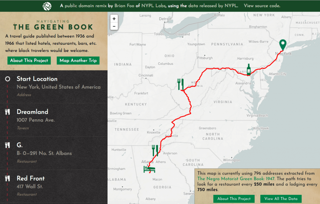
In this activity, I would ask students to get a chromebook from the back of our classroom and go to this website. Students would then pick a starting and end point. Students would have to note and 2 places to eat and at least one place to stay along their journey. This might be harder for shorter journeys because not a lot of places allowed black people to eat in their resturants or stay the night. After mapping their journey on the website, students would then have to write a letter to someone back home talking about their journey and the different places they ate and spent the night. They would also need to include some things they saw along the way that would remind them that they are in the 1930’s or 1940’s. These additions might include things like signs saying “whites only” or seeing Hoovervilles as they are traveling along. Students would also need to note how they are traveling from their different destinations, whether by foot or car, or another mode of transportation. This would be a really fun activity for students to be able to first visualize what a journey for a black person might look like prior to the Civil Rights era and also give them a space to synthesize what it was they had been learning about.

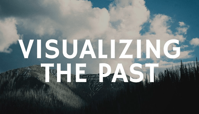
This is an activity that I think my students would enjoy and something I could see myself using in the classroom. I know when I’m trying to understand something that it helps to have a visual representation of what it is I’m studying. This helps me get a better idea of what life was like for certain people, better than just reading about it just hearing about it. When I have used interactive maps or other ways to visualize the past in my classroom, my students have responded pretty well to it. I think each of us would benefit from using these platforms to visualize the past.

18th Century Advertisements: Then vs. Now

In this activity, students will be using the “Chronicling America” online tool from the Library of Congress to search 18th century newspapers for pages with advertisements. These are easy to locate if the students are told to search “advertisements” within an 18th century date range, and the results are quite substantial for students to choose from. The purpose of this activity would be for students to understand how trade, markets, occupations, and advertisements have changed between the 18th century and now. Instead of have students locate modern advertisements, which could be an entirely different and interesting activity, students will use only the Chronicling America newspapers to discover four different types of advertisements.

First, the students will find a worker or business that would still be relevant today. The screenshot used in this post shows an example of an advertisement from a business/worker that would still be relevant today: a Goldsmith/Jeweler. The students would be asked to screenshot the advertisement on their iPad, insert that screenshot into a pages document, and below write at least 1 sentence about the ad and 1-2 sentences on why that ad would still be relevant. After this has been completed, the students will find their second advertisement that would be a business/worker that would not still be relevant today. Students will do the same process — copy their screenshot into the document and write about 2-3 sentences similar to the last ad.

Next, the students will be doing a very similar process to the two ads for workers/businesses, but this time they will be searching for specific products being advertised. For these two advertisements, students will screenshot the ad and put it in a document as the have done before, then write a few sentences that explain what the product is. One of these product advertisements should be for a product that would still be relevant today, and the other should be for a product that is no longer relevant today.

Finally, the students will finish their document with a recap of what they interpreted from the relevant/irrelevant advertisements. This recap should summarize the student’s inference as to why the relevant businesses/products are still important or relevant today, as well as why the irrelevant businesses/products would not have a purpose today. As the last step, students will try to make a connection between the changes in advertising/products/businesses over the last 200+ years and what that might say about how American society has changed along with it. There wouldn’t necessarily be a right or wrong answer to this question, rather it would be an exercise for students to practice their critical thinking and inference skills.

Hopefully this activity would be enjoyable to the students based on how big of a role advertising has in most modern student’s lives, plus critical thinking and inference are very important abilities that students should be able to practice as often as possible.

Teaching with Data Visualizations

One of the tools I plan on using with my 8th grade social studies students would be Google Trends. I feel like this tool is great for connecting student to the “relevance” of a certain word based on internet searches that were completed. For example, my students are just finishing up a unit that connected historical examples to the current event happening with Donald Trump. I could easily show my students when the subject of impeachment became a hot topic as far as internet searches. Similarly, I could show students the relationship between searches about impeachment and searches about Donald Trump. Students may find it interesting how at times spikes in searches for both of these topics happen at the same time.

Another tool I can see myself using with my students come springtime is Freedom on the Move database of runaway slaves. This is because students typically end the year with talking about the Civil War, and I think this database would absolutely be helpful in showing students how slaves were viewed and the place they had in American society in the time leading up to the Civil War. I personally found the advertisements to be enlightening in the way that they show how these people were treated like property since slave owners were offering rewards for the return of the slave they were looking for. Having students search for advertisements on their own using this site would hopefully give them more of a lens on the issue of slavery in America during mid-1800s. Furthermore, this site could definitely be useful in helping students understand causes of the Civil War in a more meaningful way because it incorporates historical artifacts of the time. I could see myself having students complete a Quick Write about their reflections after using this database and put it into context with what they are learning about the events leading up to the war.

Generally, I love the idea of using data visualizations to give students more of a connection to what they are learning and definitely want to incorporate most of the tools covered in class with my students. This is because I think many middle schoolers feel disconnected to historical events and because of that not have a grasp on their impact. However, having a visual to accompany a topic can show students its historical relevance and put it into perspective. Therefore, using data visualizations to supplement lessons is absolutely something I will be doing in my future teaching.