
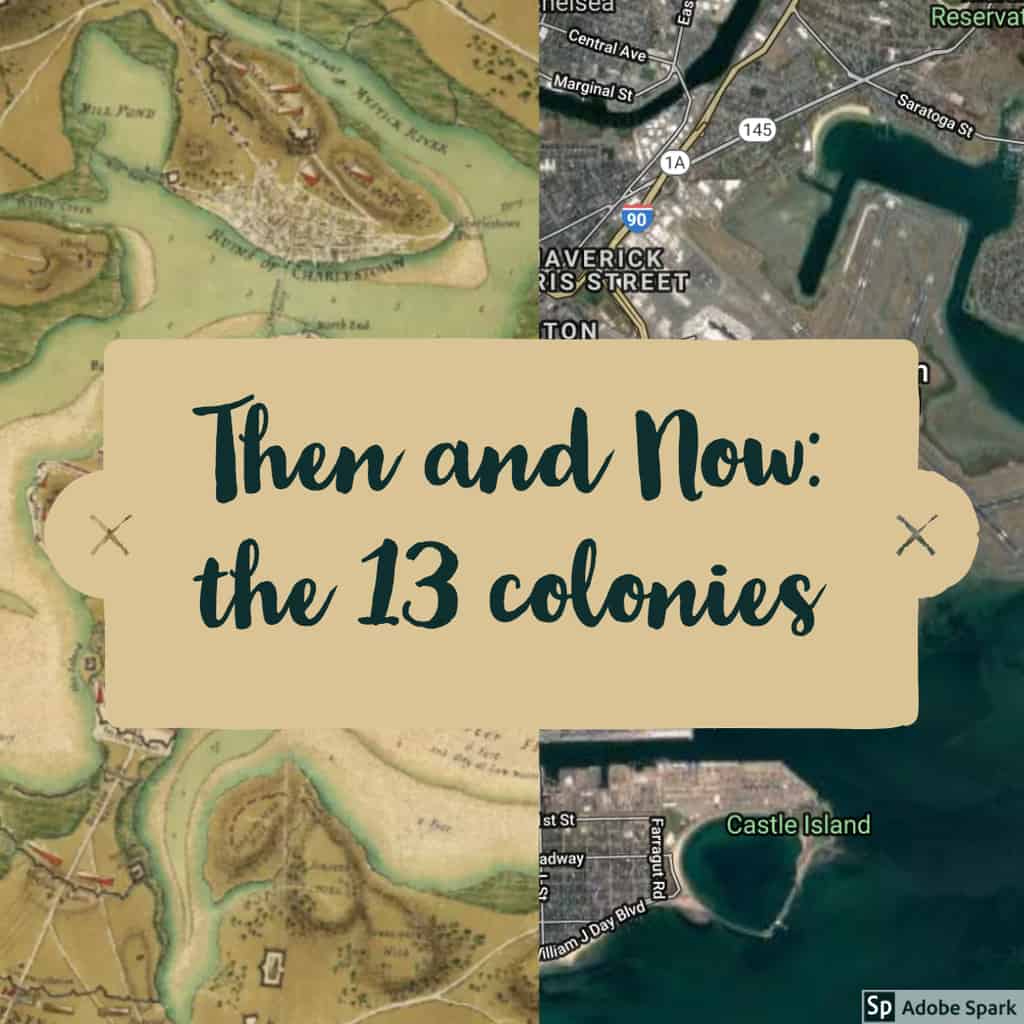
When learning about the different ways teachers can show data to their students I was automatically interested in Map Junction as it showed prominent East Coast cities progressing throughout history.
For example: image one is Boston with the left side being a map from 1776 and the right side being from 2016. In my current unit, where I am teaching the American Revolution this would be an interesting image to show students as they can see how different cities looked 250 years ago.
Tap to enlarge images
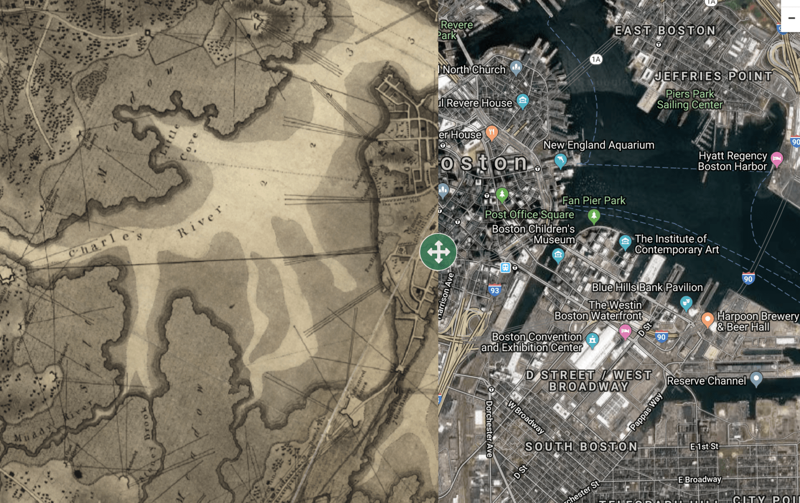
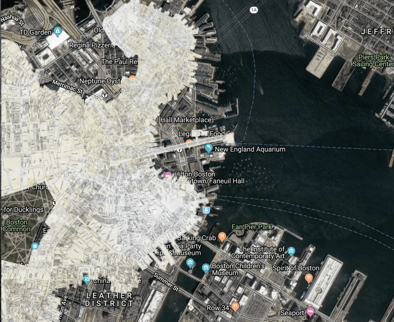
the next image is from Boston (1798 vs 2016) again this shows the students the difference 20 years can make to a city and how a key city in the up and coming New America looked.
All in all, this is an awesome tool that could be used to spark great discussion in any history classroom.