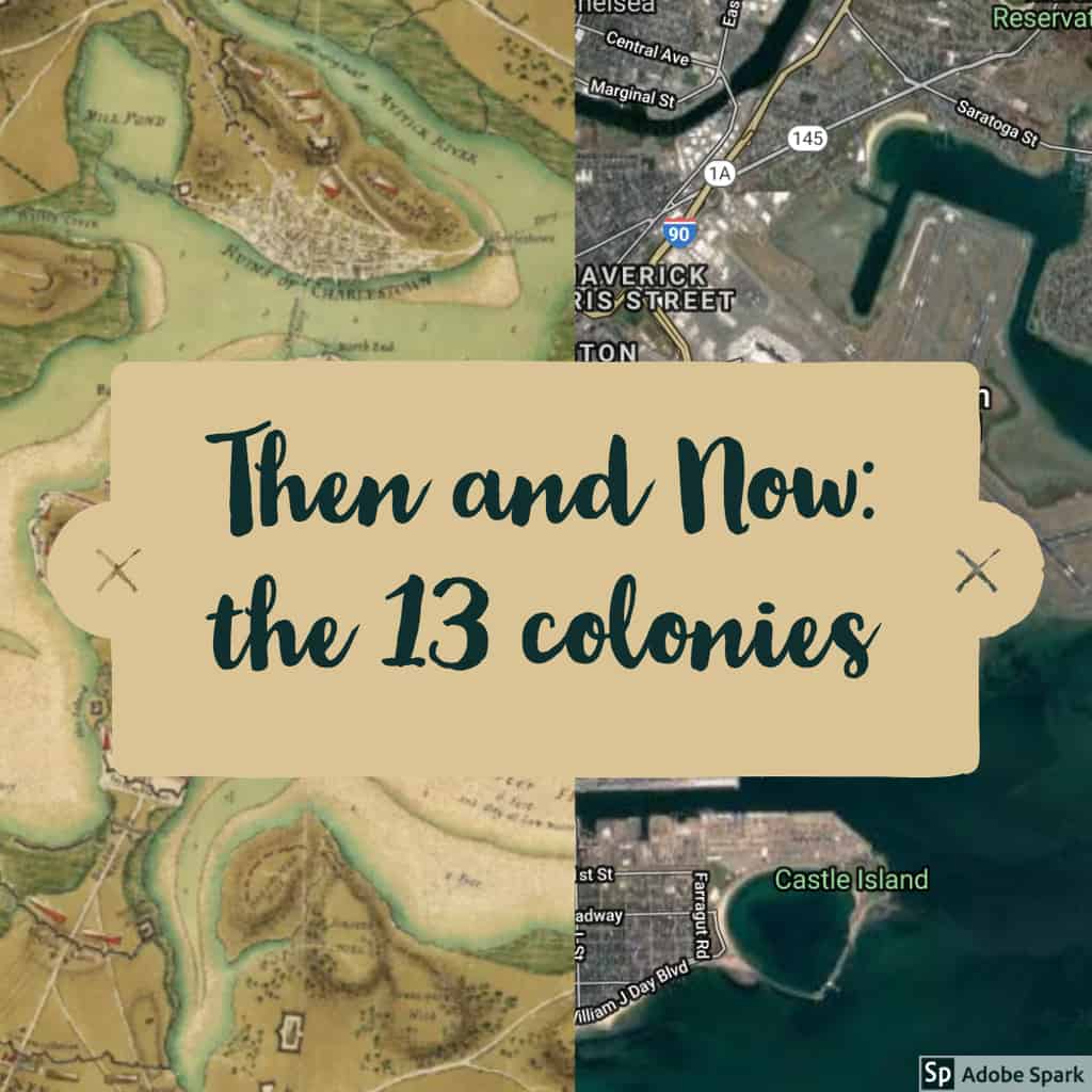
When learning about the different ways teachers can show data to their students I was automatically interested in Map Junction as it showed prominent East Coast cities progressing throughout history.
For example: image one is Boston with the left side being a map from 1776 and the right side being from 2016. In my current unit, where I am teaching the American Revolution this would be an interesting image to show students as they can see how different cities looked 250 years ago.
Tap to enlarge images
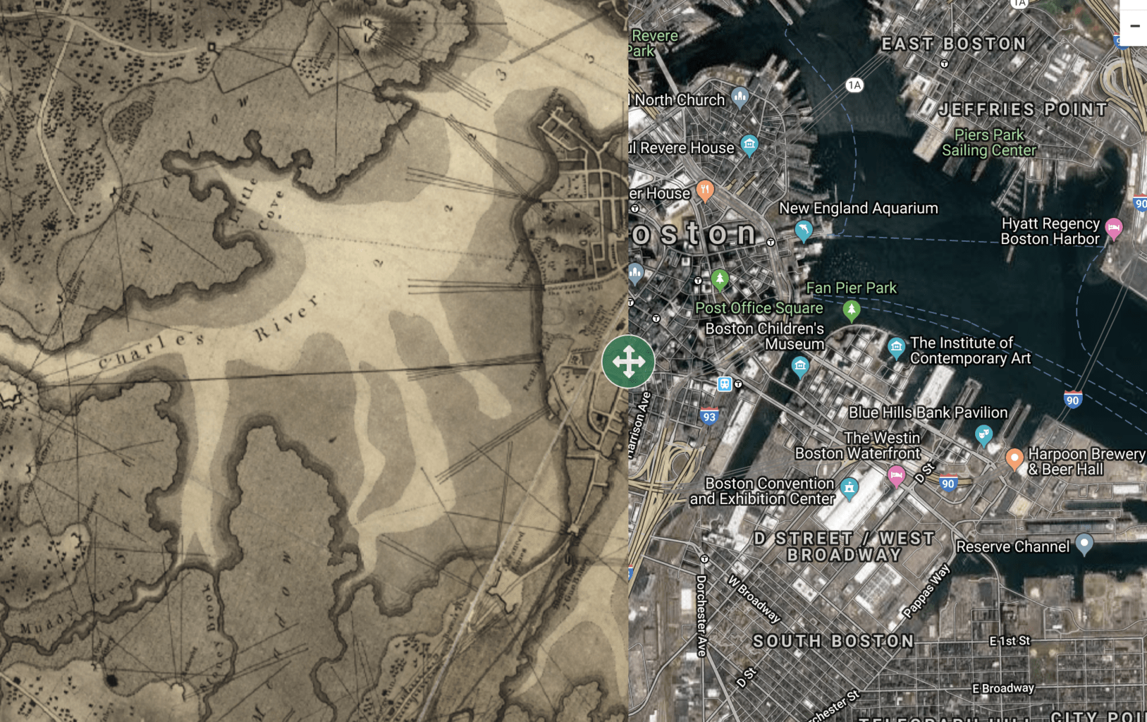
the next image is from Boston (1798 vs 2016) again this shows the students the difference 20 years can make to a city and how a key city in the up and coming New America looked.
All in all, this is an awesome tool that could be used to spark great discussion in any history classroom.
For this lesson I would use the Green Book in conjunction with the reading of the Young Adult book, The Watsons go to Birmingham. This activity would take place following the completion of the book and have the students plan their own road trip. The lesson would begin with a short discussion on The Great Migration and some of the differences between life in the North and the South using their previous reading as a guide.
Students will be introduced to the Green Book as a historical source and the teacher will project the Watson’s fictional trip on the screen as a demonstration on how to use the tool. This will be followed by a class discussion of the Green Book, sundown towns, and the implications about American society at the time. Students will be encouraged to draw parallels from other eras of history that they have learned about in past lessons, mayhap the early Nuremberg laws.
Following this students will draw a location in the North and South from a hat, and use the Green Book in order to plan a trip from the assigned locations. Students will be encouraged to check and see if any of the locations on their trip are still open using basic google searches.
As a exit ticket students will be asked to reflect on the Green Book tool and encouraged to ask several questions,When the Green Book was written, 1950’s, do you think it took longer than today to travel long distances? Do you think the mapping tools assumption of 750 miles a day is feasible or based off modern technology? How do you think the trip you planned would differ from an actual trip at the time? Students would be reminded to use the Watsons trip for context.
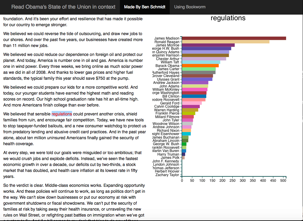
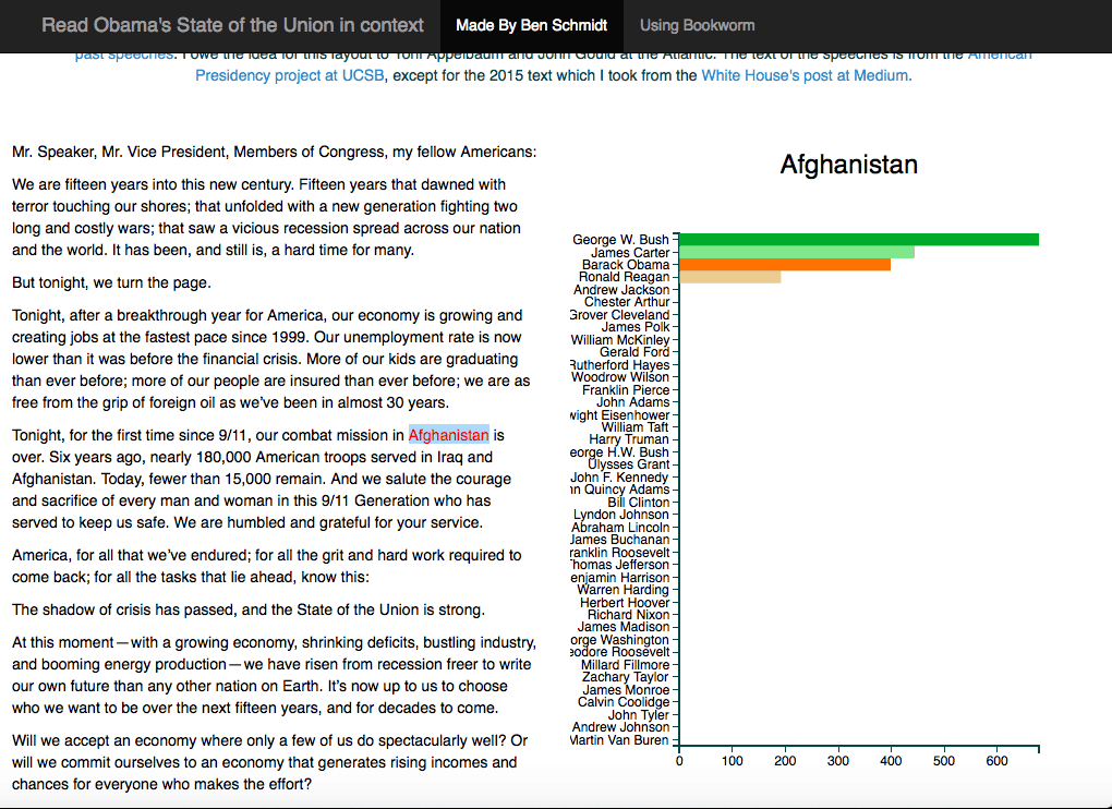
For my lesson, I will be using the State of the Union in Context which is a website that analyzes words in the state of the Union as said by previous presidents and displays a graph based on the frequency of the word usage.
My lesson would start as an introduction to the presidency and a history of the challenges presidents have had to face during their time in office. The lesson then would be based around the students taking a noun such as a name or place and looking it up with the website. The students would then briefly research the presidents that pop up on the bar graph and what the word means to them. For example, one could look up ‘Afghanistan’ and the four most prominent presidents that appear on the bar graph are George W. Bush, Obama, Carter, an Reagan .
I would then have the student research these presidents briefly and have them find out why that word was so important to their respective presidencies. Students would them present their findings to the class. Overall, this lesson would not only teach students about the different situations that presidents had to face but also could show the similar circumstances that presidents faced such as war and economic depression.
In the history class I currently teach, we are briefly covering the trajectory of race relations in America (ie. what would become the United States) from the time the first slaves arrived in the colonies to the Civil Rights movement in the 1950s and 60s. This particular lesson would fall somewhere following the death of Emmett Till as a lead-in to our unit on the Civil Rights Movement. The purpose of this lesson is to have students identify how race-based violence led to violence historically and examine how historical violence relates to an experience of violence in the United States today. This lesson will serve as an attention-grabber and primer for our lesson on the Civil Rights Movement and why the movement still matters today. Prior to this lesson, students will already understand the terms lynching and racism, as well as some of the causes of both.
I will conduct this lesson in the form of a Socratic Seminar – drawing on important details in each of the maps provided below. To begin, the class will engage in a discussion on the “Map of White Supremacy mob violence” created by Monroe Work Today. Using this map, I will begin by asking the students what they found interesting, novel, and important to our discussion on violence in America. Most notably, I’d form the discussion to help them notice the geographical and racially motivated nature of the lynchings as seem below (click on image).
Click on image to enlarge it and view in separate window.
Following our discussion on the racially motivated attacks throughout the country, I will guide the students to note that it appears these attacks first tapered off and then ended in the 1960s (leading up to our Civil Rights unit).
Then, I will show them this picture which comes Smithsonian Archives and was used in the 1963 March on Washington:
During this transition from racially motivated violence experienced in the pre-Civil Rights to racially motivated violence experienced during and after the Civil Rights era, I will show students famous images that highlight this police brutally (attack dogs and fire hoses). To end this lesson, I will conclude by asking students if they think these issues have been solved today – thus ending by showing them this map below which highlights the occurrences of people killed by police in 2018 and argues for the bias- or racially-motivated nature of many of these attacks.