Gapminder.org tools could be used by students in conjunction with economics lessons on Gross Domestic Product (GDP), Inequality, & Trade. Last week, I presented a similar demonstration, that was presented to me by Peter in Methods, to my students who had just had a lesson on GDP. Initially, we talked about the use of inflation-adjusted GDP/capita on the x-axis of the Bubble chart display, as a reinforcement of their learning about nominal versus real GDP. Any number of searches crossing economic variables measured in terms of real GDP/capita with variables such as poverty, or average age of billionaires, to tax revenue, or inflation, could be explored.
A concrete lesson activity, in conjunction with a lesson on alternative indicators of economic measurement, one could introduce the Gini coefficient with the Gapminder visual representation of life expectancy on the x-axis and the Gini coefficient on the y-axis. Students could self-select 3-5 countries to highlight and compare real GDP/capita v the Gini coefficient.
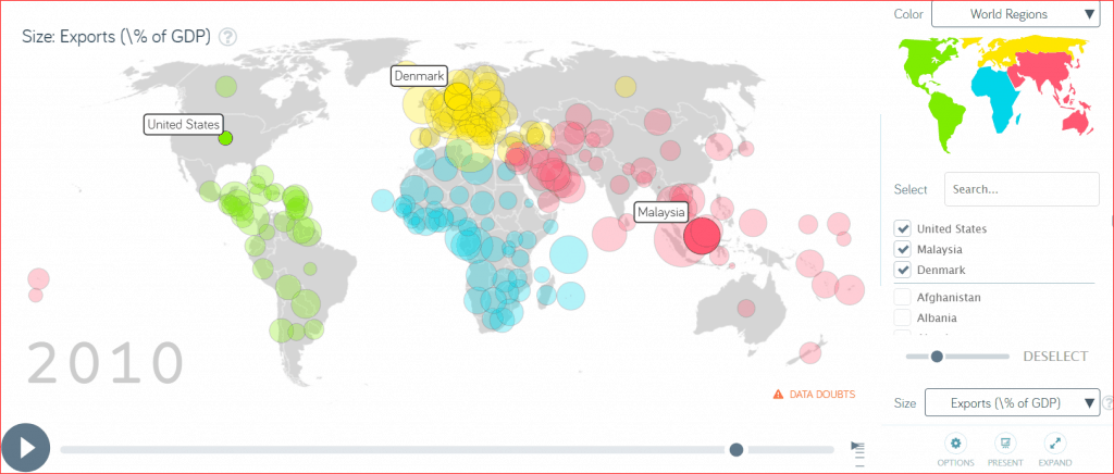
In addition, there are multiple avenues available to explore trade statistics. A potential activity for students is to explore export statistics is to select three countries and track them over time via “Exports/ % of GDP” and record their findings in a graphic organizer. For example, I selected US, Denmark, and Malaysia and selected statistics from 1965 and 2010. I found that US Exports/ % of GDP were 4.99% in 1965 and 12.4% in 2010. Similarly, for Denmark: 29.3% and 50.5%. Finally, for Malaysia: 45.1% and 86.9%. Students will then look at Imports/% of GDP for the same three countries. This is an opportunity for students to work independently or collaboratively, as well as, self-select countries based on their personal interests.


