
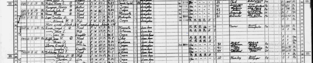
When looking for something to look at in terms of the 1940 Census and Mapping Inequality, I had never lived in any of the areas highlighted in either application. Therefore, I decided to look around the University of Portland campus. As we know from attending UP, the campus and its students are typically seen as upper middle class. Given that UP is a private, Catholic, university, the tuition is more hefty than a state school or a community college, and is only rising. While UP does give out decent scholarships, the tuition price tends to discourage incoming students. After spending 4 years on this campus, I decided to look into if UP and the area around UP has always been the way it appears now in terms of class and social community. First I looked at the census information for the people living at UP in 1940. This was when UP was still a male-only university, and based on the census information, the majority of people who lived at UP were white professors and almost all of them were not from Oregon. While this is interesting information, most of the Census sheet was not filled out about the income of these professors.

While I found this really interesting, I wanted to look more into the surrounding areas which has become known as the University Park. Today, students that live off campus typically have 3-5 roommates and live in what is considered now, larger houses. Based on the Mapping Inequality information, the University Park are is classified as yellow, which is considered “Definitely Declining” however, in the Clarifying Remarks, it claims that there are new developments in the area which could categorize some parts as low blue, making it “Still Desirable”. Parts of the North Portland are are graded blue. The Mapping Inequality also points out that many of the houses are multi-residential homes, which kind of mirrors the situation that off-campus students live in today. The average income from the time was $1,200 – $2,000 for the area as well. The area was also predominantly white without many other foreign born families.

I decided to look at the Census information around Lombard, primarily North Bowdoin St. off of Portsmouth because a few of my friends shared a house on that street. While the houses in that area were primarily built in the 1980’s, one house there still stands. It was built in 1927! It is a 2 bedroom, 1 bath, 1,029 sqft house that is estimated to be worth around $395,000 today. Thanks to the magic of Zillow, we can see that it is slightly more affordable than the houses nearby, except for the newest townhouses that were recently built.

Looking at the 1940 Census information, we can also see that the family that lived there were not as well off as their neighbors. Being a 3 member household, composed of a husband, wife, and their daughter, they had a salary or wage of $880, probably a yearly income and the father worked as a Turner for a barrel manufacture. They were a part of the lower income group in this area as most people made over $1,000.
Overall, it is interesting to see exactly what existed in 1940 and to learn about the area. A few commonalities still exist the area of UP today. In the Mapping Inequality, it points out that the projected desirability of the area would only increase in the following 50 years which it has, but today, we see this part of North Portland as a diverse area where you can walk down a few blocks and see a disparity between the overall quality of the area. This was highlighted in the Census and the Mapping Inequality website by showing the differences in people’s earning as well as highlighting the projected development in some parts. While in the 1940’s it was a predominately white area composed of people who had moved from other states, today we can see that it has diversified somewhat. I think walking around on campus, one can really see that our population is still mostly white people, but it is also reflected by the area. This is really telling of the lasting impacts of Portland’s history of red lining and the limiting of where people of color could live. We should still strive for diversity in our communities but as seen by the rising cost of living and housing costs, the trajectory that we are on will extremely limit who can live in North Portland. Unfortunately, the one of the cheapest houses in the area is one of the oldest which brings on a whole other host of potential bills and costs of what it takes to be a home owner. Either way, society as a whole would need to make some serious changes to obtain some level of true equality that acknowledges the history of the area.
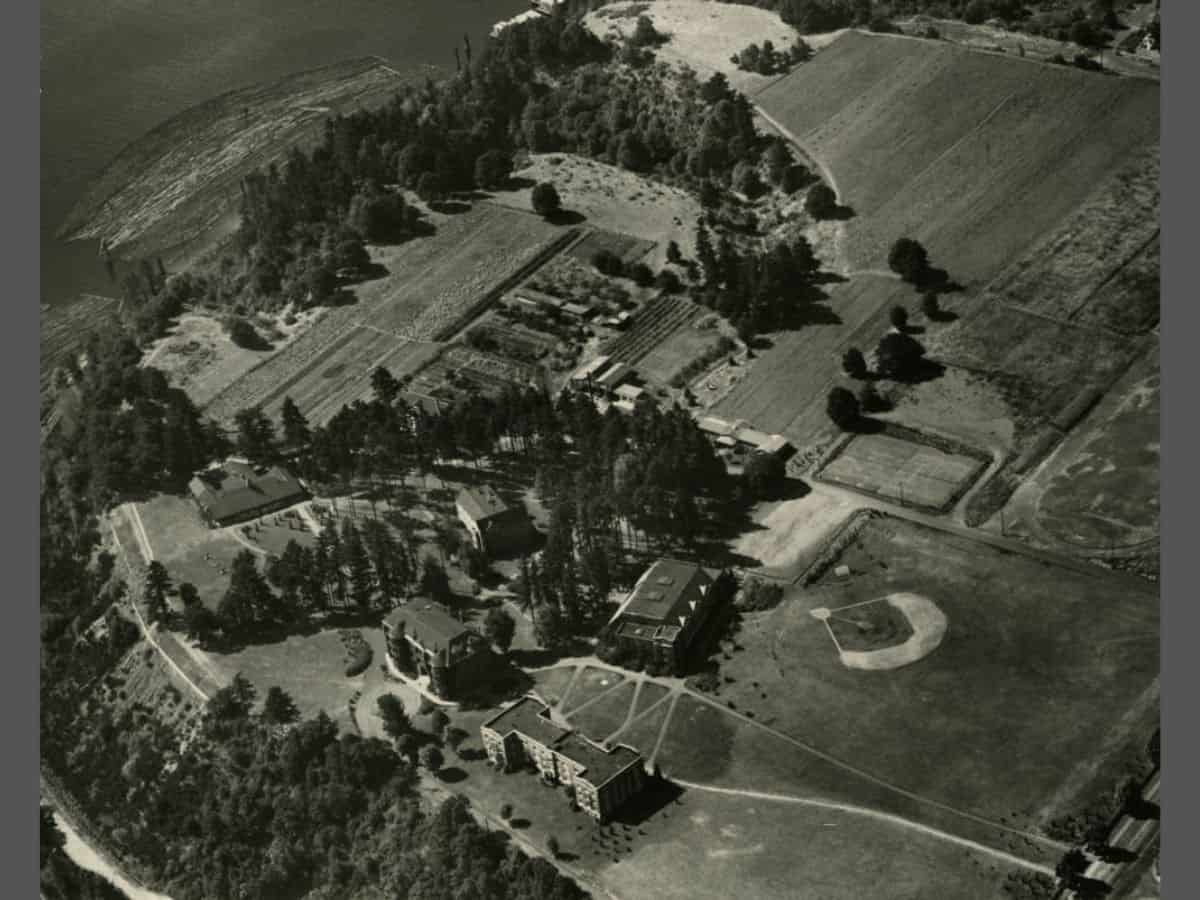
Source Image: This is a picture of the University of Portland in 1937, there are a ton of digitalized UP memorabilia like the Log (which I had to personally digitalize while working in the library, it dates back to when UP became the University of Portland in the 1930’s)
A great idea to look at campus and surrounding area. It never occurred to me that people would have lived on campus and turned up in the census. I wonder if the professors were priest and thus no “salary?”
Your analysis of the surrounding University Park is well researched and thoughtfully written. I find still Portlands lack of diversity unusual even after living here over 10 years. (Rochester was a majority black and brown city). It’s so white here.
PS Cool featured image. UP looks so tiny