My grandfather, George Adrian Peterson, who I refer to as “Papa” was a resident of Wayne County in the city that would become Detroit, Michigan. He grew up as the son of Swedish immigrants from Stockholm and was born as the first generation of American citizens. Surrounding him was expansive woodlands, an industrial complex that churned out automobiles and a neighborhood that required strong workers, let alone students.
His family worked at a lumber mill just so they could pay for his high school tuition until he was old enough to work for himself and supply his own academic expenses. Wayne county was relatively poor throughout his childhood but my grandfather especially remembers how he passed a lot of industrial sites going to school and how he would help his father on the weekends by working at the lumber yards near the edge of Detroit.
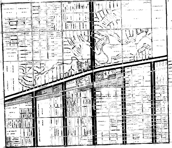
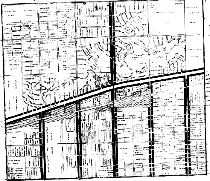
A rough map showing the streets of the neighborhood my grandfather grew up in during 1940. See source here.
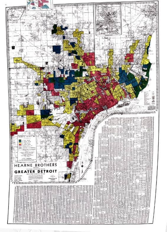
My first goal was to search through records from the 1940 census and try to find any sort of map of what the roads seemed to look like. Unfortunately, most of the maps I found were not very helpful nor did they seem to provide any detailed information about rates and costs of living in proportion to each area. However, I finally narrowed it down to what I believe to be a map of the neighborhood my grandfather lived in and from here I started to narrow down my searching to explore the economic history of the region. I learned that this region in Michigan was very factory based with most jobs going to either automobiles or power plants. While I am a bit surprised that my grandfather and his father before him were tied to lumber at first, I have to recognize that they worked just outside of Detroit to the north and are therefore exceptions. For the record, as HomeFront USA was taking off my great grandfather temporarily worked at a factory that produced ammunition and shells throughout the war while my grandfather collected scrap metal as a way of promoting the effort. They were doing their part to support Uncle Sam however they could.
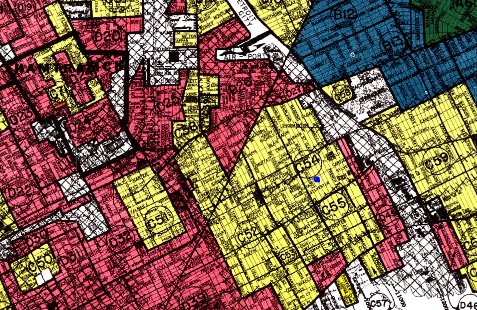
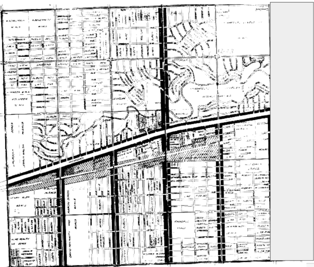
My grandfather lived between C54 and C55.
The region wasn’t the most economically prosperous according to my grandfather, which is part of the reason why he decided to move to California. According to HOLC the area where my grandfather was raised is now designated as Third Grade. The population is static without any major changes expected in population, with a wide variety of nationalities assembly of factory workers specialized in mechanics. Only a slight percentage of negroes exist in this region which indicates that people of color were designated to living in the surrounding redlined regions of Detroit. This supports testimony from my grandfather who told me how he rarely if ever saw black children growing up and how if he did they tended to be in what was deemed to be the slums at the time. When I asked him if his father, my great grandfather, worked alongside African Americans he says he couldn’t recall any by name. While this doesn’t prove that they didn’t exist in this area, it’s likely that they were discouraged from working in factories and industrial sites away from their hometowns so as to not allow for “mingling” between the races. Given that the map above has clearly defined regions, it’s clear that this was successful for a long time.
These results reveal how living conditions have defined the breakdown of populations. My grandfather, a white son of European immigrants, was raised in a community where economic conditions were challenging surrounded by more districts where work was even more challenging. This shows that the means one has to holding a successful home can determine economic sustenance and the ability to support one’s self. Those that are forced to live in unsuccessful regions are unfairly discriminated and not allowed to aspire to their fullest potential.
For the 11 years that I have lived in Portland, 6 of them have been in the same home at 4043 NE 23rd Avenue in the Sabin neighborhood. I shared this home with a group of folks that I consider to be found family. As a queer man I recognize that family is not only those that share your blood, but includes those who share experience and deep understanding of each other. In this home we saw so many important moments: couples marry and separate, two children be born and have their first milestones of life, holidays and parties, fights and reconciliations, meals and music. It was a good and happy home.
We were the odd house on the block; in a sea of single-family homes, we were one of the few rental units on the block. Our neighbors were curious at best of the place that had 6 adults sharing one roof and at times were opening scornful and cold. We frequently had neighbors ask about how many cars would be out front, who would be maintaining the yard, and in one memorable moment, ask us to not be seen outside while an open house was going on next door. It was often clear that our neighbors worried about what our presence would do to the perceived property values of their own homes.
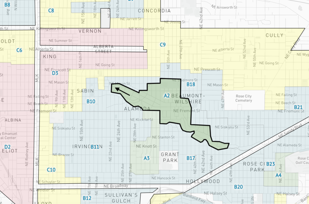
Our block of 23rd Avenue between Alameda and Mason streets is a transition zone between the ultra-wealthy and expansive homes along Alameda Ridge to the more middle-class neighborhoods surrounding the Alberta Arts District. We didn’t know much about the history of the home; but when we moved in we used Portlandmaps.com to learn that it had been built in 1920 and that our landlords had purchased it in 1990 for $55,000; by 2020 the market value of our home had risen to $510,000. This is part of a wider trend of home value increases and gentrification not only for the Sabin neighborhood and NorthEast, but for the whole city of Portland, as well.
Using the Mapping Inequality website, in 1940 my home was considered at the edge of a residential area graded as green or “Best”. There were no subversive groups present, no African-Americans, labeled as “negros” in the material, no relief families, and little chance of infiltration. The majority of homeowners had occupations that fell into the category of “Business & professional men- executives, etc.” Yet despite this designation, at the north end of the block, the designation begins to change rapidly. NE 23rd Ave, from NE Mason to NE Skidmore (a distance of one block), is downgraded to Blue or “Still Desirable” due to the “Proximity to subversive racial elements”. From NE Skidmore to NE Prescott, NE 23rd Ave is downgraded again to Yellow or “Definitely Declining” due again to the “Proximity to subversive racial elements” and “Some streets unimproved”. And finally with the start of the next block, NE Prescott, and stretching north for 6 blocks up to NE Killingsworth, NE 23rd is downgraded to Red or “Hazardous”. This area contains subversive groups, is 35% Russian, has 21 African-American families, and “many” Relief Families.
Arrow indicates where my home was located.
In 1940 this Hazardous neighborhood was perceived as an almost socio-economic Black Hole, its gravity pulling the surrounding areas down with it. It’s Trend of desirability for the next 10-15 years is rated as Static or Declining. It seems obvious today that designating an area as “Hazardous”, “in decline”, and as a threat to surrounding neighborhoods does nothing to alleviate to any issues that may exist within the area. It does nothing but help perpetuate the cycle of poverty by discouraging investment and development. Also, if the designations of Hazardous are based purely on the racial and/or ethnic background of the place, it is an impossible (and bigoted) metric to judge by. People will stay Russian or African-American, that cannot change. People who are Russian or African-American will always need a place to live, work, and raise families; their existence cannot be considered Hazardous.
I can’t help thinking about what my own household would have been like in the 1940s based on the criteria listed. In my time at 4043 NE 23rd my household included a Russian-American Jew, a Korean immigrant, a Mexican-American ex-convict, two gay men, a transsexual man, a mix-raced child, and a child born out of wedlock. We often joked amongst ourselves that we were a Conservative’s worst nightmare. In 1940 however I can’t help but think we were the poster child for a Hazardous home. I doubt that if our home had been a rental unit in 1940 we would have been allowed to rent it, or inside of it for that matter.
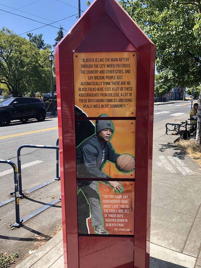
In the years following 1940 this area of Portland became increasing Black. Alberta became the heart of a vibrant neighborhood with African-American owned businesses and cultural centers. However, the legacy of Redlining, the systematic denial of services, especially financial services to groups of people based on race or ethnicity, caused Portland’s African-American population to be concentrated, and often, excluded from the opportunity of home-ownership. By the early 1990’s when The Oregonian broke the story on Redlining through its series Blueprint for a Slum some homes in the area were only selling for $3,500; ironically, the same price as my home was worth in 1940. The lack of traditional lenders for African-Americans led desperate would be home owners to turn to risky financing; in this case loans offered by Dominion Capital Inc. Buyers would purchase loans unaware that Dominion had loaned more than what the properties were wort. This predatory behavior was ignored by the Attorney General until the story broke.
Since the early 2000s the neighborhoods around Alberta have quickly gentrified, especially after the area rebranded itself as the Alberta Arts District. Where once this area brought the surrounding neighborhoods property values down due to its racial makeup and the presence of other so-called undesirables it is now raising property values and seeing a rash of development. Cruelly and ironically this reversal of fortune has spelt disaster for the African-American community surrounding Alberta. As property values rise and new condos, apartments, galleries, and hip businesses move African-Americans have been pushed out of the area, once again being denied the access of social mobility and the building of wealth.
Signpost commemorating African-American history on NE Alberta St. Taken by Abe Asher for The Mercury.
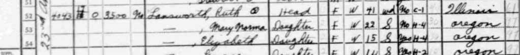
Using the US Census for this project I found that in 1940 this home belonged to the Lansworth family, headed by Ruth, a 41 year old widow, originally from Illinois. Ruth worked in the garment industry, mending hosiery and was raising her 3 daughters: Mary-Norma age 22, Elizabeth age 15, and Grace age 14. I feel a certain joy in knowing that Ruth worked in textiles as my own housemate, Megan, started her own clothing and mending business, Golden Dinosaur, in the front room of our home. It was a connection to the past that stretched some 74 years. I wonder what Ruth would make of her home and her neighborhood all these years later.
Ruth Landsworth and her daughters in the 1940 US Census
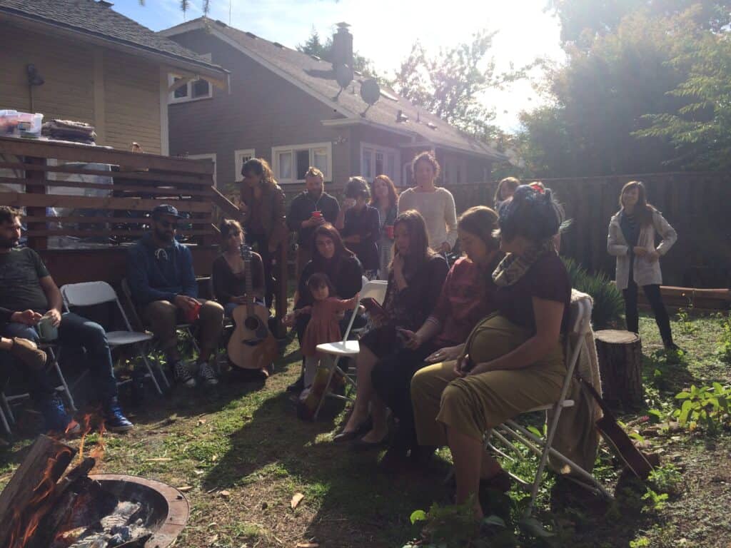
My chosen family and I shared this home until 2020. The COVID-19 pandemic upended our plans for living together. Several of us, including myself, lost our jobs due to the lock-down. Our landlords were patient, but ultimately we knew the rent was too high for us to pay with only unemployment and eventually we certain that we would be evicted. We went our separate ways, but we stayed in contact and relatively near each other.
Photo of Our Community in the Backyard of 4023 NE 23rd Avenue. Photo by me.
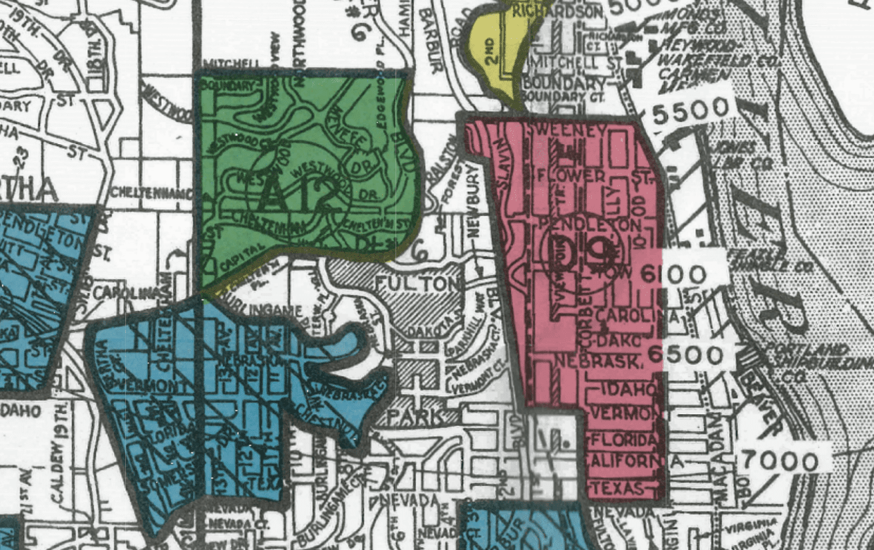
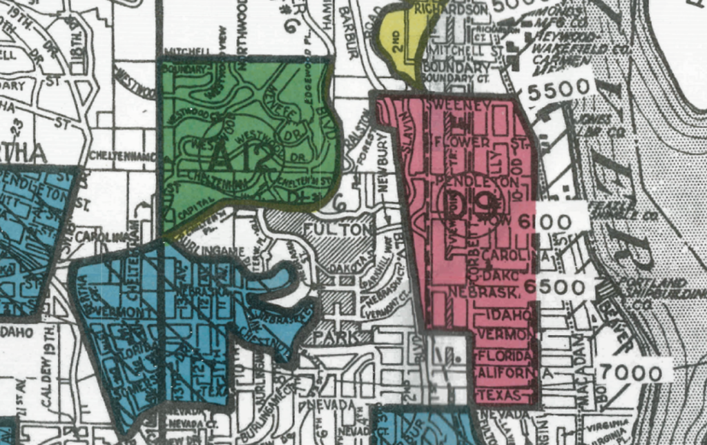
A look at a Redlining map of Portland, Oregon can offer immense insight into the city’s past, but it also provokes many questions. My first thought when looking at the above map was “how can two neighboring areas be classified into two opposing groups?”. I was especially interested by the zones within Southwest Portland. In this area, there are many green “best” zones but also red “hazardous” zones.
Section of Redlining Map Focused on Southwest Portland From Mapping Inequality
I decided to focus my investigation on one smaller area of Southwest Portland (pictured above). How can two zones, separated by what looks to be a few blocks, be classified so differently?
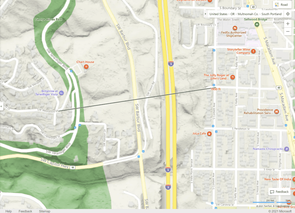
The first step I took in answering this question was to orient myself to this area. The following map shows an updated aerial view of the northern areas of the above zones. The “best” zone, Terwilliger Heights, is on the left-hand side. This neighborhood is set apart from highways and industry, separated by nature parks. The houses are set upon winding and looping roads, each with substantial greenery.
The neighboring area to the east, however, is composed primarily of industry. The gridlock pattern of streets and houses make up South Portland. This area, according to the redlining map, was once a “hazardous” zone.
Screenshot from Bing Maps
As seen in the map below, these two neighborhoods were separated by a distance of only 1900 feet. As of the 1960s, these areas were divided too by Interstate 5. Why were they so different before this physical divider?
Screenshot from Bing Maps
The 1940s Census tells us unique stories about the people who lived two neighborhoods. Terwilliger heights was composed of single-family, mansion style homes. Families in this neighborhood were almost entirely white and wealthy. The Census for the neighborhood around SW Westwood Dr. and SW Menefee Dr. show that family incomes ranged between 2000 and 5000+. Most people in this area were born in Oregon or a neighboring state. Very few were immigrants from other countries.
The South Portland “hazardous” zone, however, was made up of many different groups of people. While both neighborhoods boasted single-family homes, South Portland’s houses were much smaller and closer together. Families here, while still predominantly white, come from all different areas. The Census for this area showed that many people here were immigrants from European countries such as Italy and Sweden. Family incomes were between 500 and 1500.
The main difference I saw between these neighborhoods were between the backgrounds and occupations of the residents. The people of South Portland, living in an industrialized area, mostly worked in industrial positions, such as laborers and machinists. Residents of the Terwilliger area, on the other hand, had positions such as lawyers and business men.
The divide between these neighboring areas, now solidified by I5, looks to have been created because of the residents in these places. This, in turn, was caused by the proximity of these neighborhoods to industry.
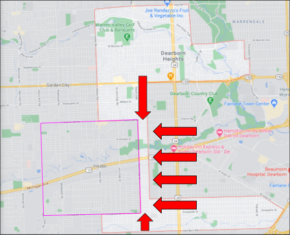
At a glance, the present-day boundary of Dearborn Heights, Michigan, is an amorphous mess. Most cities in this area are intuitively zoned, but this is not the case for Dearborn Heights. On a map, the northern and southern sections of Dearborn Heights do not have adjacent boundaries. Instead, these sections are attached by a thin, protruding boundary that is approximately a twentieth of a mile wide and two-and-half miles long (see fig. 1). This peculiar boundary even runs right through the middle of a park, which makes the same park zoned for both Dearborn Heights and neighboring city, Inkster. If you compare the boundaries of Dearborn Heights to Inkster, it seems that the boundary that connects northern and southern Dearborn Heights is like a puzzle piece that fits into Inkster perfectly. In fact, this is because the neighborhoods within this unbefitting boundary once belonged to Inkster (see fig. 2).
Fig. 1. Present-day map of Dearborn Heights and Inkster that indicates the boundary in question. From Google Maps, boundary of Inkster and red arrows added by me.
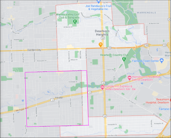
Fig. 2. Same map as in fig. 1, but with markings to show what Inkster would look like with its older boundaries in relation to Dearborn Heights. From Google Maps, boundary of Inkster added by me.
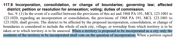
The boundary of Dearborn Heights appears to be a scattered mess when in actuality, this boundary was meticulously crafted to exclude African Americans and include the whiter portions of Dearborn and Inkster. The African American community of Inkster had a significant portion of their village annexed for the creation of Dearborn Heights in 1960. Understandably so, many Inskter residents were outraged over the annexation. The annexation was fought in two court cases, the first of which, Inkster v. Board of Supervisors, challenged that the annexation was statutorily illegal. However, a lower Michigan court ruled that the annexation of Inkster was legal because of the following clause in the Michigan Home Rule City Act:
This vote was held for people to be included in the incorporation of Dearborn Heights. Because of this, the vast majority of Inkster residents were shut out of the vote since the proposed boundary for Dearborn Heights included portions of Inkster that had lower African American populations. Also note that Inkster was a village during this time, so it lacked the same protections and guarantees as cities; had Inkster had cityhood, the annexation would not have been possible. The vote resulted in the northern part of Dearborn to not be incorporated into Dearborn Heights, but it included the southern part of Dearborn along with an annexed section of Inkster. Racial motivations aside, the annexation by itself was legal since people within the territory proposed for Dearborn Heights’ incorporation were able to vote on the matter.
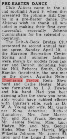
Despite the ruling of Inkster v. Board of Supervisors, another lawsuit was filed. However, the new lawsuit challenged the annexation on constitutional grounds rather than statutory grounds. This led to the emergence of Taylor v. Dearborn in which the plaintiffs argued that the city boundary plan for Dearborn Heights was segregationist and intended to create an all-white city. “Taylor” in Taylor v. Dearborn is named Thomasina Taylor and she was a resident of Inkster who was known for community involvement. Although Taylor does not take part in Inkster v. Dearborn, her work after this ruling gave rise to Taylor v. Dearborn.
Newspaper article from April 16, 1949 showing Thomasina Taylor’s involvement in the Inkster community. Unfortunately, I could not find anything about Thomasina in the 1940 census. From Chronicling America.
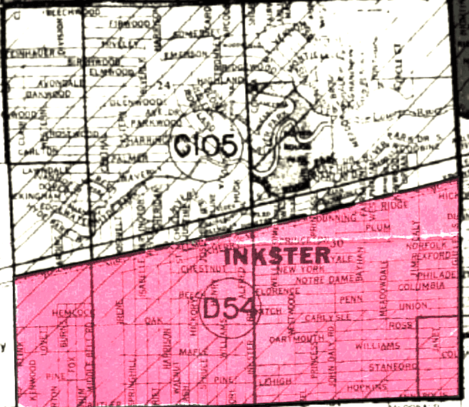
Similar to the outcome in Inkster v. Board of Supervisors, Taylor v. Dearborn ruled in favor of the incorporation of Dearborn Heights, thus keeping the annexation of Inkster intact. The plaintiffs argued that the annexation violated their 14th and 15th Amendment rights because the boundaries for the incorporation of Dearborn Heights was predominantly white; the part of Inkster that was annexed also had lower concentrations of African Americans. This is indicated by the below figure of Inkster taken from Mapping Inequality (this map is from 1939).
The part of Inkster that is marked in red is described as “Almost entirely occupied by negroes”, while the upper half mentions “It is doubtful that this area will improve greatly in view of the poor reputation of Inkster”. The upper half mentions nothing about race, while it is a major focus in the lower half. This indicates that more African Americans lived in the lower half of Inkster in the 1940s. This trend continued in the 1960s and is corroborated by Eugene Black, a Justice who sat on the Michigan Supreme Court for both Inkster v. Board of Supervisors and Dearborn v. Taylor. In his opinion for Taylor v. Dearborn, Justice Black acknowledged “The heaviest areas of Negro residence are in the southwest quadrant of the village, and in the westerly half of the southeast quadrant thereof west of Bayhan.”
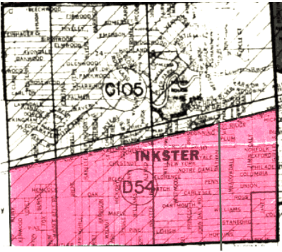
What Justice Black was saying was saying is that most African Americans living in Inkster lived predominantly in the southwest quadrant and in southeast quadrant, but west of the street called Bayhan. Note that the above map is a pre-annexed map. Below is the same map, but showing the boundaries of Inkster after the annexation.
From Mapping Inequality, markings that indicate Bayhan and Inkster post-annexation added by me.
Between Justice Black’s statement about most African Americans in Inkster living west of Bayhan (again, indicated by the gray line) and corroborating data from Mapping Inequality, the portion of Inkster annexed to incorporate Dearborn Heights included areas with the lowest concentration of African Americans in Inkster. With this information in mind, it becomes clearer that the incorporation of Dearborn Heights was indeed racially motivated. Due to the Michigan Home Rule City Act, the annexers could have annexed even more land from Inkster, but the only land left to annex would be further west, and the further west you head in Inkster, the more African Americans there are. The annexation of Inkster was a blatant redline that was made possible by institutional racism since even Justice Black, who acknowledged that the annexation included very little African Americans in the boundaries of Dearborn Heights, was not racially motivated.
Effects of the Annexation
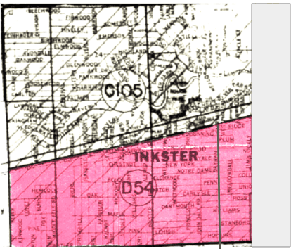
Before and after the annexation, Inkster has always been a quadrangle. Before the annexation, the length of Inkster was approximately 2.75 miles with a width of around 2.5 miles. In total, pre-annexed Inkster had approximately 6.875 square miles of land within its boundary. After the annexation, Inkster’s length was reduced to approximately 2.5 miles, and its width remained the same at around 2.5 miles. With the shrunken boundary, Inkster now has 6.25 square miles of land. This means that Inkster lost approximately .625 square miles of land after the annexation, which is roughly a ten percent loss . This had economic consequences for Inkster, since the shrunken boundaries reduced the overall income of the city; the annexed land was primarily residential, so Inkster lost a significant portion of property tax revenue.
Google Maps’ “measure distance” tool was to used to find the above numbers for my calculations.
Same map as before, but the grayed portion indicates the land lost from the annexation. From the 1940 Census National Archives, gray rectangle added by me.
Information about Inkster v. Board of Supervisors obtained from Nexis Uni.
Information about Taylor v. Dearborn obtained from Nexis Uni.