Class 13: Exploring Digital History

Exploring Digital History

Overview

History and other humanities that tended to be narrative are leveraging  data collection and display tools to spawn a new digital / data approach to teaching history and social science. In today’s class we will explore some of these exciting web resources.

Class Session | Zoom Video

Class opened with a student-led lesson by Alex Priaulx | Zoom video

We will get an introduction to these sites. Then students will work in teams exploring sites and generating ideas for how they could be used in class. There will also be time for individual meetings with students to report on progress toward final projects.

Assignment

There is no assignment for this class. Students will be working on final projects.

Resources

Nation level data sets

  1. GapMinder World – manipulate moving bubble graphs, select x and y axis from a variety of data sets
  2. Rank Country – insightful world maps and country list data visualizations.

Text-based tools

  1.  NGram Viewer – online research tool that allows you to quickly analyze the frequency of names, words and phrases -and when they appeared in the Google digitized books. For more advanced searches using NGram Viewer click here.
  2. Google Trends – see how often specific keywords, subjects and phrases have been queried over a specific period of time.
  3. WordSift was created to help teachers manage the demands of vocabulary and academic language in their text materials. 

Map-based tools

  1. American Panorama – the parent project of Mapping Inequality – has a variety of map based projects.
  2. Atlas of the Historical Geography of the United States, first published in 1932. Now in digital / interactive format
  3. Timelapse – is a global, zoomable video that lets you see how the Earth has changed over the past 32 years.
  4. Metrocosm – All the World’s Immigration Visualized in 1 Map
  5. Two Centuries of U.S. Immigration  – map with graph and date slider
  6. MapJunction  – Compare US city maps over time

Social justice projects (example American racial history)

  1. Freedom on the Move – database of runaway slave advertisements
  2. White Supremacy mob violence – interactive / historical map of lynching in US.
  3. Negro Travelers’ Green Book – map based version of the famous travel guide for Black Americans.

Featured image from Foreign Born Population of the United States
Class 12: Explore Place with Digital Maps

Explore Place with Digital maps

“Places are locations having distinctive features that give them meaning and character that differs from other locations. Therefore, places are human creations, and people’s lives are grounded in particular places. We come from a place, we live in a place, and we preserve and exhibit fierce pride over places.” 

National Geography Standard 4: Place

Overview

In today’s class we will explore three mapping tools:  Google Tour Creator, StoryMapJS and Google MyMaps . They are easy platforms for teachers and students to create and share interactive maps that can contain additional multi-media content. 

Class Session | Zoom Video

Peter will offer a brief intro into each app and students will take an initial look at how to use each app. Students will work in teams to master the app and develop a presentation to share back with the class. We will then generate some ideas for how each app could be used in the classroom.

Assignment: There is no assignment from this class.

Google Tour Creator (a Google project) uses Google’s vast StreetView library as well as additional surround images to to build immersive, 360° tours right from your computer. It can be easily embedded in WordPress or shared via email and social media. Demo tour. 


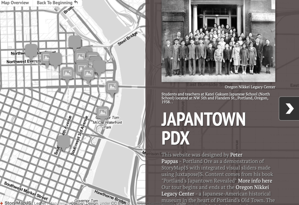
StoryMapJS from Knight Labs is a free tool to help you tell stories on the web that highlight the locations of a series of events. StoryMap JS can pull in media from a variety of sources. Twitter, Flickr, YouTube, Vimeo, Vine, Dailymotion, Google Maps, Wikipedia, SoundCloud, Document Cloud and more!

Keep it short. I recommend not having more than 20 slides for a reader to click through. Pick stories that have a strong location narrative. It does not work well for stories that need to jump around in the map.

Note: it is possible to get an embed code from StoryMapJS. But it does not display well as an embed. Better to get a screenshot and turn it into a hyperlink so viewers can directly view your StoryMap

https://uploads.knightlab.com/storymapjs/5a8c590bb2ecb583d79fb8c53fd9c417/test-1/index.html

Google MyMaps is a great tool for visualizing place with a variety of content and locational tools. You can add a variety of content to a MyMap. It can be easily embedded in WordPress or shared via email. MyMaps gets saved in your Google Drive account for easy cataloging. Map below by Jessica Webber.


Resources

Ideas for using Tour Creator and a “how to” below
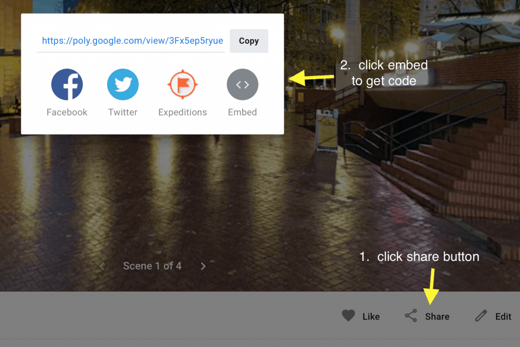
How to get Tour Creator embed code – Once you have published your tour. Click on “View Tour” then follow two steps below to get embed code
Once you have published your tour. Click on “View Tour” then follow two steps above to get embed code

StorymapJS

MyMap “how to’s” below

Featured Image by Gerd Altmann from Pixabay 

Class 11: Designing Inequality

The Detroit Eight Mile Wall is a one-foot-thick , six-foot-high  separation wall that stretches about 1⁄2 mile. It was constructed in 1941 to physically separate Black and white homeowners on the sole basis of race. The wall no longer serves to racially segregate homeowners and, as of 1971, both sides of the barrier have been predominately Black. Photo by John Vachon / Library of Congress

Overview

This class will explore the largely forgotten government policies that segregated nearly every major American city and metro area. We will also look at how those unconstitutional actions have fostered inequality in America since their enactment in the 1930s. In preparation for this class students watched the video Segregated by Design.

Class Session | Zoom video

Class will open with the brief film Housing Segregation and Redlining in America: A Short History. We will next work in groups exploring the disparities in segregated neighborhoods.

Students will receive instruction on how to work with this week’s archival websites and there will be an introduction to our final project due on Nov 28th.


Class will also include student led lesson by: Lillian Healy | Zoom video


Assignment 11: Bring Census and Redline Maps to Life | Redline stories 20-A11

Students will use the website Mapping Inequality: Redlining in New Deal America and the 1940 US Census to explore how the “redline” maps created by agents of the federal government’s Home Owners’ Loan Corporation (HOLC) between 1935 and 1940 segregated cities all across America.

HOLC Map of Portland Or

The focus should be on how the “redline” HOLC categories (best, still desirable, definitely declining and hazardous) are reflected in data from the 1940 census. And how those mortgage regulations shaped the lives of people who lived there

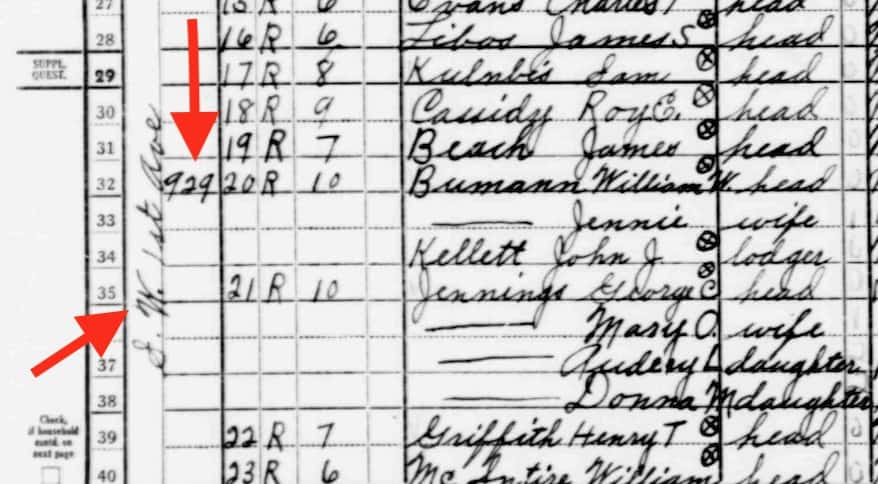
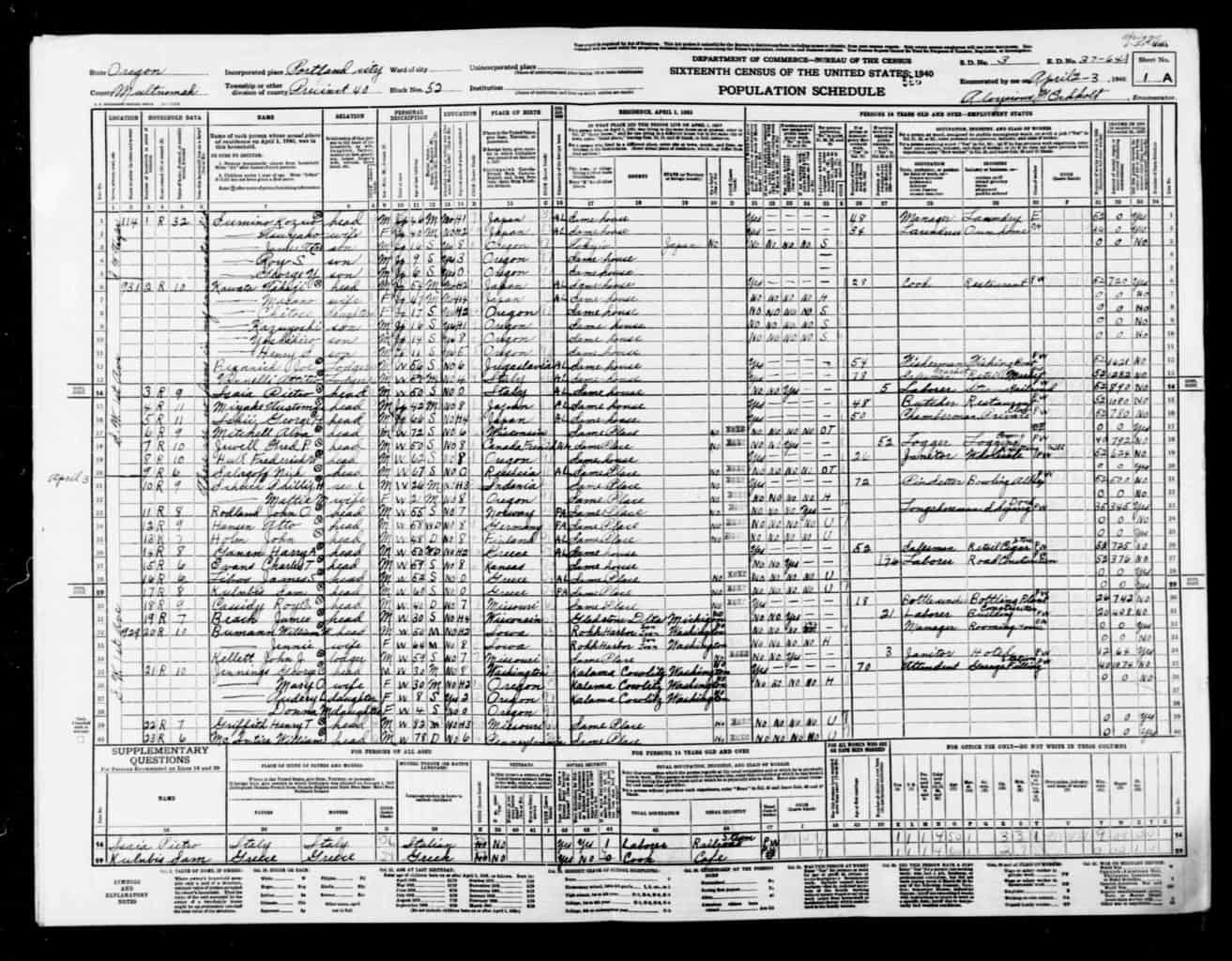
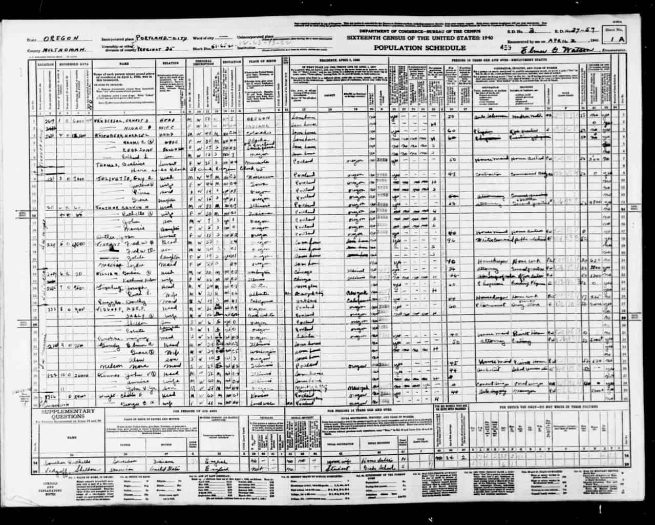
Page from 1940 Census: Portland Oregon SW 1st Ave designated “Hazardous” D8 Southwest River District

Whatever approach you choose, your post should include standard elements – title, featured image, citations / links from public domain content. You may also want to use screen shots from the Mapping Inequality maps or text from the neighborhood descriptions. Or screenshots from the the 1940 census.

This is meant to be a creative exercise – so feel free to explore some options such as:

You could identify neighborhoods in Mapping Inequality and find the data from the corresponding location in the 1940 census. You may want to choose a neighborhood here in Portland or some other city. It could be one you or a family member has lived in.

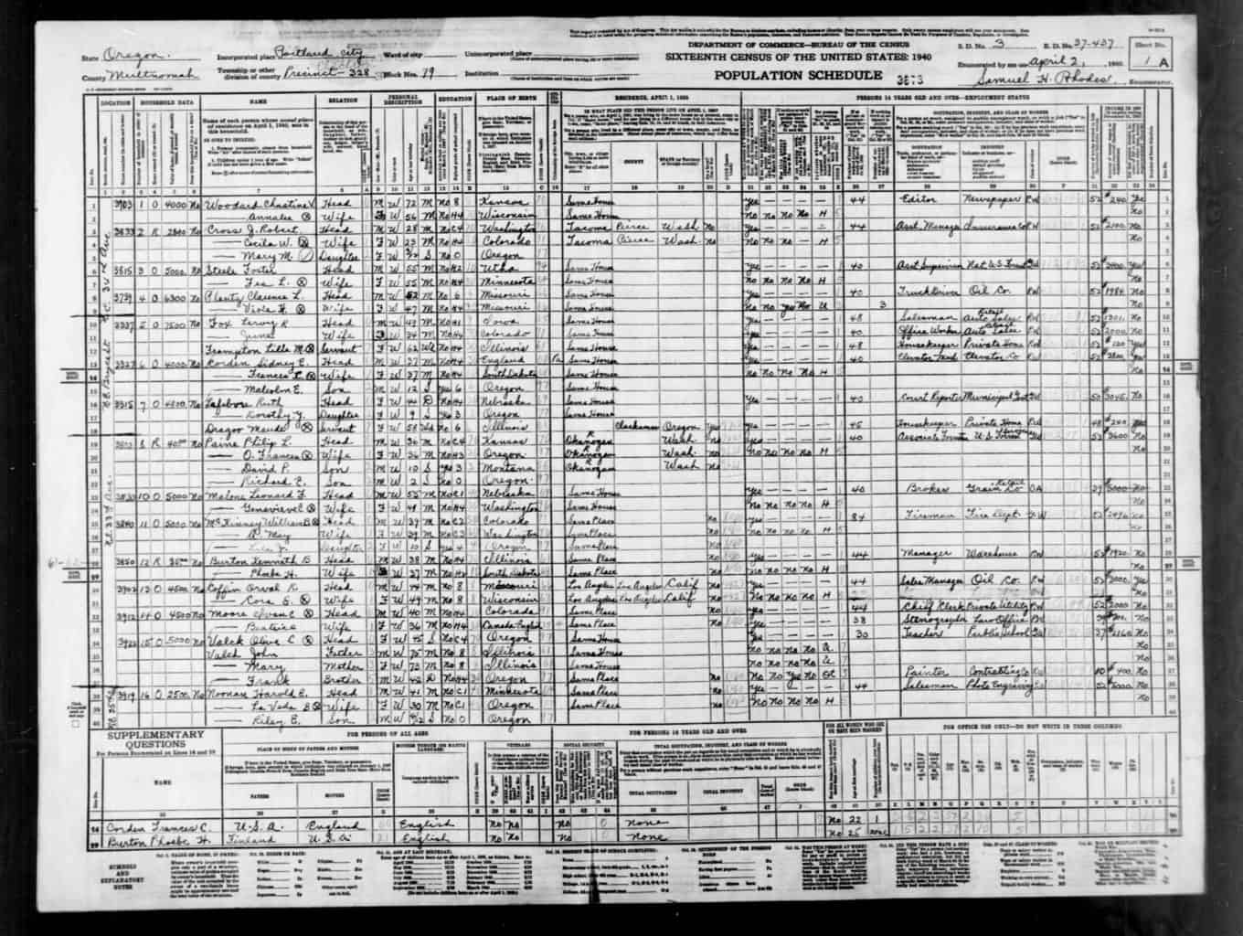
You could use the Census information to select a few families on that street to “tell their story” using data from the census – names, family members, housing, income, employment, country of birth. Using currency converters you could represent their home value, rent and income in current dollars.

Take a comparative approach – using information from a “Best” and “Hazardous” defined neighborhoods in the same city.

Assume the role of an actual family in the census and tell their story more narratively in the first person and illustrate with images from the era that represent the setting or examples of their type of employment.

If you had a family member who was in the census of 1940 and lived in a neighborhood identified on a HOLC – you could tell their story or what happened to your family since.

Compare neighborhood designation and some Census data 1940 to what the neighborhood is like today (Data from Zillow or Redfin. Which also sometime show interiors of home.)


Resources


The 1940 census works better in Chrome than Apple Safari.

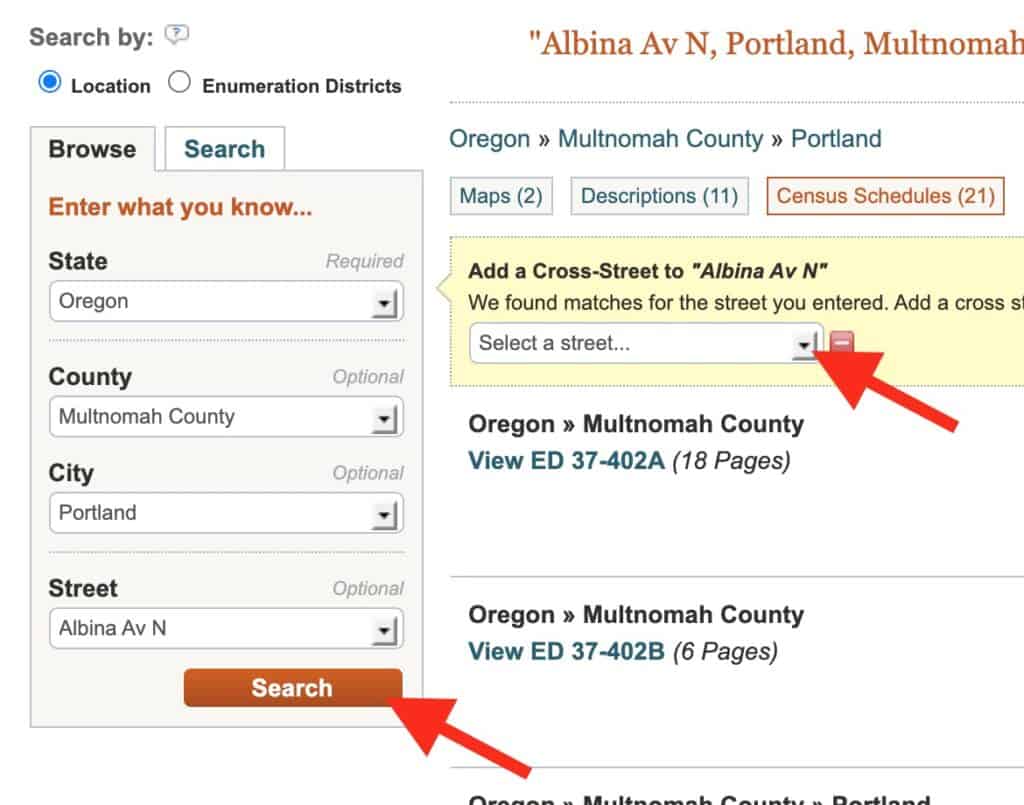
You will “search by location where the person lived.” Begin by narrow search by state, county, city, street.

After you click search, you have the option to add a cross street.

It will take you to multipage document that may not exactly zero in on the intersection you wanted. You may need to scroll through some pages to get to that location. You can find the streets and house numbers on far left. (Street written vertically)


Sample Census page and locations today

931 SW 1st is now the World Trade Center

3315 NE Bryce Today

229 SW Wright Today

Class 10: Who Gets to Vote?

Featured image: Who Gets to Vote

Overview

This class will examine the essential question – who gets to vote in the US. (And who doesn’t). It will also be a chance to explore a bit of role play.

This class will include two student-led lessons by :
Angela Nguyen | Zoom video
Maggie Loft | Zoom video (Some of lesson is on Nearpod, not video)

Class Session | Zoom Video

We will begin by discussing the question: What should the requirements be for voting in the United States?  We will then identified groups that have traditionally been the target of voter suppression. Student will then work in groups to design voter laws.

Finally students will assume the roles of voters and look at the impact of voter regulations on their right to vote. Note: this lesson is inspired by “Who Gets to Vote? Teaching About the Struggle for Voting Rights in the United States” from the Zinn Education Project.

Our process in more detail:

  1. Open with them Brainstorm on a shared Jamboard “What should be the requirements for voting in the United States?”
  2. Then brainstorm on a shared Jamboard – some categories of people who have been targeted with voter suppression.
  3. Broke into 3 groups and asked them to brainstorm on Jamboard regulations that would suppress targeted groups of voters.
  4. I had prepared a condensed list of voters from the lesson mixer role play. Assigned one to each student.
  5. Students met in breakout groups to discuss their roles and how any of our new regulations impacted their right to vote.
  6. Session ended with an open discussion of what they’ve heard on the subject of voter suppression in the 2020 cycle.

Since it is the eve of election day – we will also make some predictions.

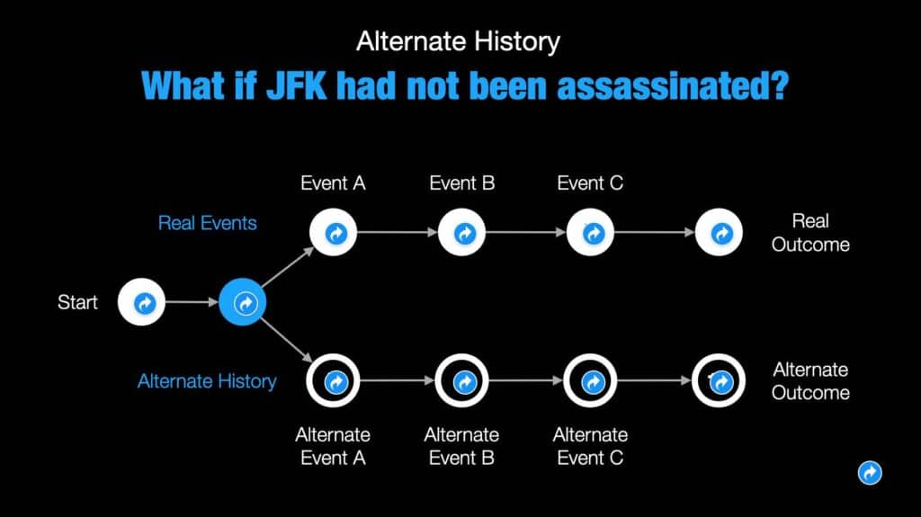
Assignment 10: Design an Alternative History | Alt histories 20-A10

In preparation for next week’s class – students should watch the video. Segregated by Design. It examines the forgotten history of how our federal, state and local governments unconstitutionally segregated every major metropolitan area in America through law and policy.


In honor of the historic nature of the 2020 election, students will have the opportunity to explore historical turning points and their own creativity by designing an alternative history. Students should have fun with this. It could be set in any era or region of the world.

You should embed the slide show in a post. Include at least an explanation on why you feel this event was a historical turning point.

Click here to make a copy and then modify.

Resources

It’s recommended that you begin my making a few copies of the template. Might be good in back up or to use with your students. Take care not break the built in hyperlinks. This template was adopted from a Keynote template created by Aussie educator, Jamie Clark @XpatEducator. See his collection of Teaching & Learning Resources. (Lots of great free downloadable templates.)

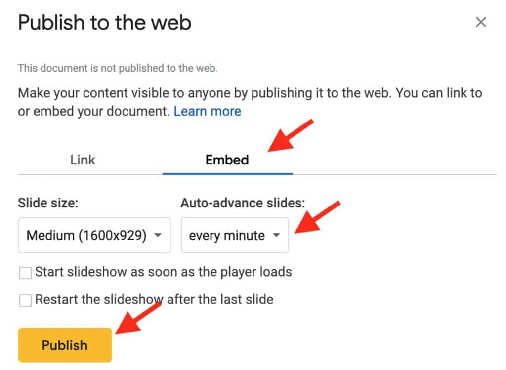
How to prepare you Google slide for embedding on blog post

  1. Once you have finished slide show. Set Share to “Anyone with a link can view.”
  2. On toolbar click “File/Publish to web.”
  3. Click on embed
  4. Set “auto-advance” to every minute. (That will give viewer chance to navigate.)
  5. Click publish and you will get embed code to use with HTML Snippets.

Featured image Photo by Unseen Histories on Unsplash
Caption reads, “[Marchers with signs at the March on Washington, 1963]” Original black and white negative by Marion S. Trikosko. Taken August 28th, 1963, Washington D.C, United States (@libraryofcongress). Colorized by Jordan J. Lloyd. Library of Congress Prints and Photographs Division Washington, D.C. 20540 USA https://www.loc.gov/item/2013648849/